ZCheckBox

A checkbox allows users to select or deselect an option. In contrast to radiobuttons each checkbox has an independent state. The state can be toggled by using Space or if set by using a keyboard mnemonic.
The key to toggle the checkbox is usually shown highlighted when set using markup to set its text.
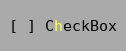
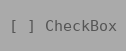
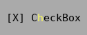
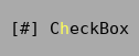
A checkbox is either checked or unchecked. If the tristate attribute is enabled it additionally supports a third partially checked state. The partially checked state is commonly used when a checkbox represents a summary of multiple states and it’s represented states contain both checked and unchecked values. A checkbox shown as partially checked by convention indicates that none of the represented substates will be altered.
Example
Tui::ZCheckBox *checkbox = new Tui::ZCheckBox(Tui::withMarkup, "C<m>h</m>eckbox", dialog);
layout->addWidget(checkbox);

QObject::connect(checkbox, &Tui::ZCheckBox::stateChanged, [](Qt::CheckState state) { /* ... */ });
Keyboard Usage
Key |
Result |
|---|---|
Space |
Activate the button |
Alt + (setup mnemonic) |
Activate the button |
(setup shortcut) |
Activate the button |
Behavior
Checkboxes by default accept focus, are one cell high and have a expanding vertical layout policy. The size request of a checkbox is the length of the text plus 5 cells plus the contents margins.
When the user toggles the state of the checkbox (e.g. using the Space key) the state advances to the next state
(depending on the tristate mode either between Tui::Unchecked and Tui::Checked or
cycling through the states Tui::Unchecked, Tui::Checked and Tui::PartiallyChecked)
and emits a stateChanged() signal.
Palette
Palette Color |
Usage |
|---|---|
|
Body of the checkbox (active, unfocused) |
|
Body of the checkbox (active, focused) |
|
Body of the checkbox (disabled) |
|
Shortcut character in checkbox text. |
ZCheckBox
-
class Tui::ZCheckBox : public Tui::ZWidget
A checkbox widget.
Constructors
-
ZCheckBox(WithMarkupTag, const QString &markup, Tui::ZWidget *parent = nullptr);
Create the checkbox with the given
textormarkup.
Functions
-
void setText(const QString &text);
Get or set the plain text content of the checkbox.
When set the shortcut is also reset.
When the content of the checkbox was most recently set using
setMarkup()the returned text is empty.
-
void setMarkup(const QString &markup);
Get or set the text content of the checkbox using markup.
When set the shortcut is also reset, if the markup contains a mnemonic it is setup as new shortcut.
When the content of the checkbox was most recently set using
setText()the returned markup is empty.
-
Tui::CheckState checkState() const;
-
void setCheckState(Tui::CheckState state);
The
checkStateis the displayed state of the checkbox. It can beTui::Unchecked,Tui::CheckedorTui::PartiallyChecked.Using the setter will not cause
Tui::ZCheckBox::stateChanged()to be emitted.
-
bool isTristate() const;
-
void setTristate(bool tristate = true);
If the tristate attribute is false the checkbox alternates between the states
Tui::UncheckedandTui::Checked.If tristate is enabled it cycles through the states
Tui::Unchecked,Tui::CheckedandTui::PartiallyChecked.
-
void setShortcut(const Tui::ZKeySequence &key);
Set the given
keyas shortcut for the checkbox.
Signals
-
void stateChanged(Tui::CheckState state);
This signal is emitted when the user changes the state or the state is changed through the
void Tui::ZCheckBox::toggle()function.The new state is passed in the
stateparameter.
Slots
-
void toggle()
Toggle through the states of the checkbox and emit
Tui::ZCheckBox::stateChanged().
-
void click()
If the checkbox is enabled, focus the checkbox and toggle through its states and emit
Tui::ZCheckBox::stateChanged().If the checkbox is disabled, does nothing.
-
ZCheckBox(WithMarkupTag, const QString &markup, Tui::ZWidget *parent = nullptr);
