ZLabel

Checkbox with text “CheckBox”

reflecting focus of “buddy” widget

in disabled state

with custom palette
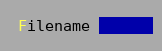
with “buddy” input box
Labels display user interface text in a dialog.
They are often used to label other widgets and if setup with a “buddy” widget also serve to show focus for that widget.
For example Tui::ZInputBox and Tui::ZListView do not display focus indication themselves and can be
augmented with a label to show focus.
In contract to a label the Tui::ZTextLine does not reserve a cell as focus indicator and doesn’t have
support for a “buddy” widget or showing a keyboard shortcut.
See also: Tui::ZTextLine
Example
Tui::ZLabel *label = new Tui::ZLabel(Tui::withMarkup, "<m>F</m>ilename", dialog);
Tui::ZInputBox *textinput = new Tui::ZInputBox(dialog);
label->setBuddy(textinput);
layout->addWidget(label);
layout->addWidget(textinput);
Keyboard Usage
Key |
Result |
|---|---|
Alt + (setup mnemonic) |
Focus the label’s “buddy” widget. |
Behavior
Labels by default don’t accept focus, are one cell high and have a preferred vertical layout policy. The size request of a label is the length of the text plus 1 cells plus the contents margins.
The effective enabled/disabled status for its visual appearance is the logical-AND combination of both its own status and the “buddy” widget’s status (if a buddy is set).
For its visual appearance the relevant focus status is that of its “buddy” widget, if there is no “buddy” widget, the label will always appear as unfocused.
The shortcut from the label’s markup is used to focus the “buddy” widget.
Palette
Palette Color |
Usage |
|---|---|
|
Body of the label (active, unfocused) |
|
Body of the label (active, focused) |
|
Body of the label (disabled) |
|
Shortcut character in label text. |
ZLabel
-
class Tui::ZLabel : public Tui::ZWidget
A label widget.
Constructors
-
ZLabel(WithMarkupTag, const QString &markup, Tui::ZWidget *parent = nullptr)
Create the label with the given
textormarkup.
Functions
-
void setText(const QString &text)
Get or set the plain text content of the label.
When set the shortcut is also reset.
When the content of the label was most recently set using
setMarkup()the returned text is empty.
-
ZLabel(WithMarkupTag, const QString &markup, Tui::ZWidget *parent = nullptr)
