ZRadioButton
A set of radiobuttons allows users to select from a set of options presented as multiple widgets. In contrast to checkboxes a group of radiobuttons together represents a choice of options.
The state can be changed by using Space or if set by using a keyboard mnemonic.
The key to toggle the checkbox is usually shown highlighted when set using markup to set its text.
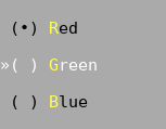
In a group of radiobuttons only one button can be checked at a time. If another button is checked the button currently checked will get unchecked automatically.
All radiobuttons sharing a common parent are one radiobutton group.
Example
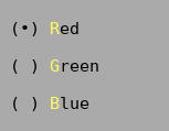
Tui::ZRadioButton *radiobutton1
         = new Tui::ZRadioButton(Tui::withMarkup, "<m>R</m>ed", dialog);
layout->addWidget(radiobutton1);

Tui::ZRadioButton *radiobutton2
         = new Tui::ZRadioButton(Tui::withMarkup, "<m>G</m>reen", dialog);
layout->addWidget(radiobutton2);

Tui::ZRadioButton *radiobutton3
         = new Tui::ZRadioButton(Tui::withMarkup, "<m>B</m>lue", dialog);
layout->addWidget(radiobutton3);

QObject::connect(radiobutton1, &Tui::ZRadioButton::toggled, [](bool state) { /* ... */ });
QObject::connect(radiobutton2, &Tui::ZRadioButton::toggled, [](bool state) { /* ... */ });
QObject::connect(radiobutton3, &Tui::ZRadioButton::toggled, [](bool state) { /* ... */ });
With two groups:
// First group using parent1 widget and a layout in parent1 called layout1
Tui::ZRadioButton *radiobutton1
         = new Tui::ZRadioButton(Tui::withMarkup, "<m>B</m>lue", parent1);
layout1->addWidget(radiobutton1);

Tui::ZRadioButton *radiobutton2
         = new Tui::ZRadioButton(Tui::withMarkup, "<m>G</m>reen", parent1);
layout1->addWidget(radiobutton2);

// Second group using parent2 widget and a layout in parent2 called layout2
Tui::ZRadioButton *radiobutton4
         = new Tui::ZRadioButton(Tui::withMarkup, "<m>R</m>ound", parent2);
layout2->addWidget(radiobutton4);

Tui::ZRadioButton *radiobutton3
         = new Tui::ZRadioButton(Tui::withMarkup, "<m>S</m>quare", parent2);
layout2->addWidget(radiobutton3);
Keyboard Usage
Key |
Result |
|---|---|
Space |
Activate the button |
Alt + (setup mnemonic) |
Activate the button |
(setup shortcut) |
Activate the button |
Behavior
Radiobuttons by default accept focus, are one cell high and have a expanding vertical layout policy. The size request of a radiobutton is the length of the text plus 5 cells plus the contents margins.
When the user checks a radiobutton (e.g. using the Space key) all other radiobuttons in the group are unchecked
and it emits a toggled() signal on all radiobuttons in the group.
It is not possible to uncheck all radiobuttons in a group using the keyboard, but it is possible for the application to set all radiobuttons to unchecked.
Palette
Palette Color |
Usage |
|---|---|
|
Body of the radiobutton (active, unfocused) |
|
Body of the radiobutton (active, focused) |
|
Body of the radiobutton (disabled) |
|
Shortcut character in radiobutton text. |
ZRadioButton
-
class Tui::ZRadioButton : public Tui::ZWidget
A radiobutton widget.
Constructors
-
ZRadioButton(WithMarkupTag, const QString &markup, Tui::ZWidget *parent = nullptr)
Create the radiobutton with the given
textormarkup.
Functions
-
void setText(const QString &text)
Get or set the plain text content of the radiobutton.
When set the shortcut is also reset.
When the content of the radiobutton was most recently set using
setMarkup()the returned text is empty.
-
void setMarkup(const QString &markup)
Get or set the text content of the radiobutton using markup.
When set the shortcut is also reset, if the markup contains a mnemonic it is setup as new shortcut.
When the content of the radiobutton was most recently set using
setText()the returned markup is empty.
-
bool checked() const
-
void setChecked(bool state)
The
checkedstate is the displayed state of the radiobutton. Setting a radiobutton using this function does not update other radiobuttons in the group.To automatically disable the other radiobuttons in a group use
void Tui::ZRadioButton::toggle().
-
void setShortcut(const Tui::ZKeySequence &key)
Set the given
keyas shortcut for the radiobutton.
Signals
-
void toggled(bool state)
This signal is emitted when the user changes the state or the state is changed through the
void Tui::ZRadioButton::toggle()function.The new state is passed in the
stateparameter.
Slots
-
void click()
Set the radiobutton to the checked state and emit
toggled(bool state). All other radiobuttons in the group will be set to unchecked and emittoggled(bool state).
-
void toggle()
If the checkbox is enabled, focus the checkbox set it to the checked state and emit
toggled(bool state). All other radiobuttons in the group will be set to unchecked and emittoggled(bool state).If the checkbox is disabled, does nothing.
-
ZRadioButton(WithMarkupTag, const QString &markup, Tui::ZWidget *parent = nullptr)
