Concepts
Widgets and widget tree
Tui Widgets is a nested and stacked widget system. The user interface is divided into elements called widgets that encapsulate reusable interface elements like buttons, labels or windows.
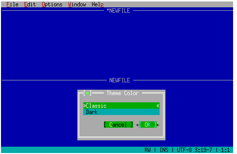
User view¶ |
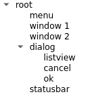
Logical structure¶ |
|
The direct children of a widget are stacked in a given order. Widgets higher in the stack occlude lower widgets. Limited transparency is supported when a widget does not paint parts of its surface. Each widget can only draw in the rectangle covered by its parent.
Terminal
All input and output happens through a terminal.
The terminal is represented in Tui Widgets by the ZTerminal class.
Usually, an application has one instance of this class that is connected to the terminal the application runs in,
but one application interacting with multiple terminals is supported as well.
For a widget tree to be usable it needs to be connected to a terminal using the setMainWidget method.
ZTerminal also manages terminal wide state, such as the currently focused widget.
Palette
As application authors prefer different color schemes, Tui Widgets has a palette concept that maps abstract roles to colors.
Palette color lookup follows the widget tree starting at the root. For each widget on the path from the root to the widget, color definitions and color rules are collected. Rules allow switching active colors based on the palette class of a widget.
For example different types of windows use different color schemes and this is realised by palette rules matching on the classes “dialog” and “window”.
On the other hand, a widget can have a local palette overriding colors for this widget and its decendents adhoc.
ZPalette predefines two color schemes:
classic
blue windows
grey dialogs
based on classic 90s look
grey
mostly monochrome with different brightness levels
The predefined palettes currently assume that most controls are used as children of a window. If controls are used without a window, colors for these controls need to setup manually.
Markup
There are widgets that support using a simple markup for defining their text contents.
Currently the only supported tag is the m tag which allows specifing a mnemonic part of the text that is highlighted
and used to generate a keyboard shortcut for the widget from.
When setting the contents in the constructor markup interpretation is usually enabled by prefixing the string
with an additional argument with the value Tui::withMarkup.
When working with an already existing instance, there is a setMarkup method to set text interpreted as
markup.
The markup language is based on the basic html syntax with elements starting with a tag in the form of <m> and
terminating with an end tag in the form of </m>.
If the actual text contents should contain a < character it needs to be escaped using <.
Root / Windows
ZRoot and windows (e.g. ZWindow and ZDialog) create a window based structure for
an application.
However applications are not required to use these classes and can implement their own alternatives.
Each window is a (possibly overlapping) rectangular part of the terminal that has an optional title
and can optionally be rearranged in the terminal.
By using F6 (and Shift+F6) the user can switch between windows.
If a window contains controls the user can switch between these controls using Tab (and Shift+Tab).
Applications using windows should use ZRoot as the root of the widget tree and as parent of the windows.
This class implements switching between windows using F6 and various other window related tasks.
ZSymbol
Tui Widgets uses strings as identifiers in various places.
Using strings is helpful for namespace management when multiple independent developers create libraries and
identifiers are widely scoped.
To reduce possible performance impact of many string comparisons, strings are converted to ZSymbol instances.
The ZSymbol system maintains an internal mapping of all strings used as symbols to integer values,
so that simple integer comparisons can be done after lookup.
ZSymbol is used for storage and in places where implicit conversation from QString is not desired.
In constract ZImplicitSymbol can be used where ease of use requires implicit conversion.
Drawing Model
Tui Widgets follows a drawing model based on a grid of character cells. Characters can be one or two cells wide. Characters with a width of two cells (also called wide characters) can only be erased as one unit. When a wide character is erased, it is replaced by two space characters with the color of the erased character.
Drawing is done using a instance of ZPainter.
ZPainter does not keep state related to colors or display style, but only translation offset and clipping.
Painters are either used for drawing to memory buffers unrelated to widgets or for drawing a widget’s content.
For drawing to a memory buffer (ZImage), a painter can be obtained from the ZImage instance.
For drawing the contents of a widget, a widget defines a custom version of the drawEvent() method
and obtains a painter from the passed draw event.
The painter used with a widget is already translated and has clipping set up,
so that the widget has a local coordinate system and cannot paint outside of its bounds.
