ZMenu

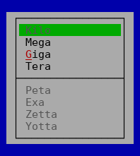
A popup menu
ZMenu can be used to create popup menus.
A popup (or context) menu can be used to offer multiple action related to the currently selected item.
After the menu is opened, it can then be navigated using the cursor keys and a command selected using Enter or by pressing the highlighted character or the menu can be left using Esc.
The menu system uses commands to determine if a menu item is currently available and to trigger an action if the user activates a menu item.
The application must setup the menu with a collection of menu items to gain a functional menu using
void Tui::ZMenu::setItems(QVector<Tui::ZMenuItem> items).
Currenty sub-menus are not supported.
The menu is usually created with the root widget as parent and opened by using the
void Tui::ZMenu::popup(const QPoint &p) function.
Example
QVector<Tui::ZMenuItem> items =  {
    {"Kilo", "", "kilo", {}},
    {"Mega", "", "mega", {}},
    {"<m>G</m>iga", "", "giga", {}},
    {"Tera", "", "tera", {}},
    {},
    {"Peta", "", "peta", {}},
    {"Exa", "", "exa", {}},
    {"Zetta", "", "zetta", {}},
    {"Yotta", "", "yotta", {}}
};

Tui::ZMenu *menu = new Tui::ZMenu(root);
menu->setItems(items);

QObject::connect(new Tui::ZCommandNotifier("mega", root),
                 &Tui::ZCommandNotifier::activated, [&] { /* ... */ });

QObject::connect(new Tui::ZCommandNotifier("giga", root),
                 &Tui::ZCommandNotifier::activated, [&] { /* ... */ });

QObject::connect(new Tui::ZCommandNotifier("tera", root),
                 &Tui::ZCommandNotifier::activated, [&] { /* ... */ });

menu->popup({1, 1});
Keyboard Usage
Key |
Result |
|---|---|
Esc |
Close the menu |
F10 |
Close the menu |
Enter |
Active the current menu item |
↑ |
Cycle through menu items up |
↓ |
Cycle through menu items down |
(highlighted letter) |
Active the menu item with the corresponding letter |
Behavior
The menu uses stacking layer 20000 by default and acts like a window with
extend viewport enabled.
The menu ensures that its parent widget has a command manager by calling
ensureCommandManager() on its parent.
When activated the menu bar grabs the keyboard. It then allows the user to browse the menu and activate the menu items.
(ZMenu does not support use as popup menu when disabled)
Palette
Palette Color |
Usage |
|---|---|
|
Main color for the menu |
|
Shortcut character in menu items |
|
Selected menu items |
|
Shortcut character in selected menu items |
|
Menu items with disabled command or disabled menu bar |
|
Selected menu items with disabled command |
ZMenu
-
class Tui::ZMenu : public Tui::ZWidget
A popup menu widget.
Functions
-
QVector<Tui::ZMenuItem> items() const
The menu items to display in the menu.
Currently sub-menus are not supported.
-
void setParentMenu(Tui::ZMenubar *menu)
Used by
Tui::ZMenubarto implement its sub-menus.
-
void popup(const QPoint &p)
Open this popup menu at the given point.
This grabs the keyboard and displays the menu with an automatic size and a position based on
p.
Signals
-
void aboutToHide()
This signal is emitted just before the popup menu is hidden on close.
-
void aboutToShow()
This signal is emitted just before the popup menu is shown.
-
QVector<Tui::ZMenuItem> items() const
